

Photographs For The Record
Photographs For The Record
Six music albums with appropriated images for their artwork

Sometimes I envy vinyl collectors. Not only can they play their music when the internet goes down. But, depending on their taste, they get two pieces of art for the price of one. Musicians use visuals to help sell their records. And the more discerning choose pre-existing images over pictures of themselves. Here are six occasions music artists appropriated photographs for their album artwork.
Bruce Davidson & Fontaines D.C.
While on honeymoon in Ireland in 1967, Bruce Davidson turned his camera to the James Duffy & Sons circus. His interest lay in the daily lives of performers and those who worked behind the scenes. Forty years later, he combined these photographs with images he had made previously and published them in the photobook Circus (2007).
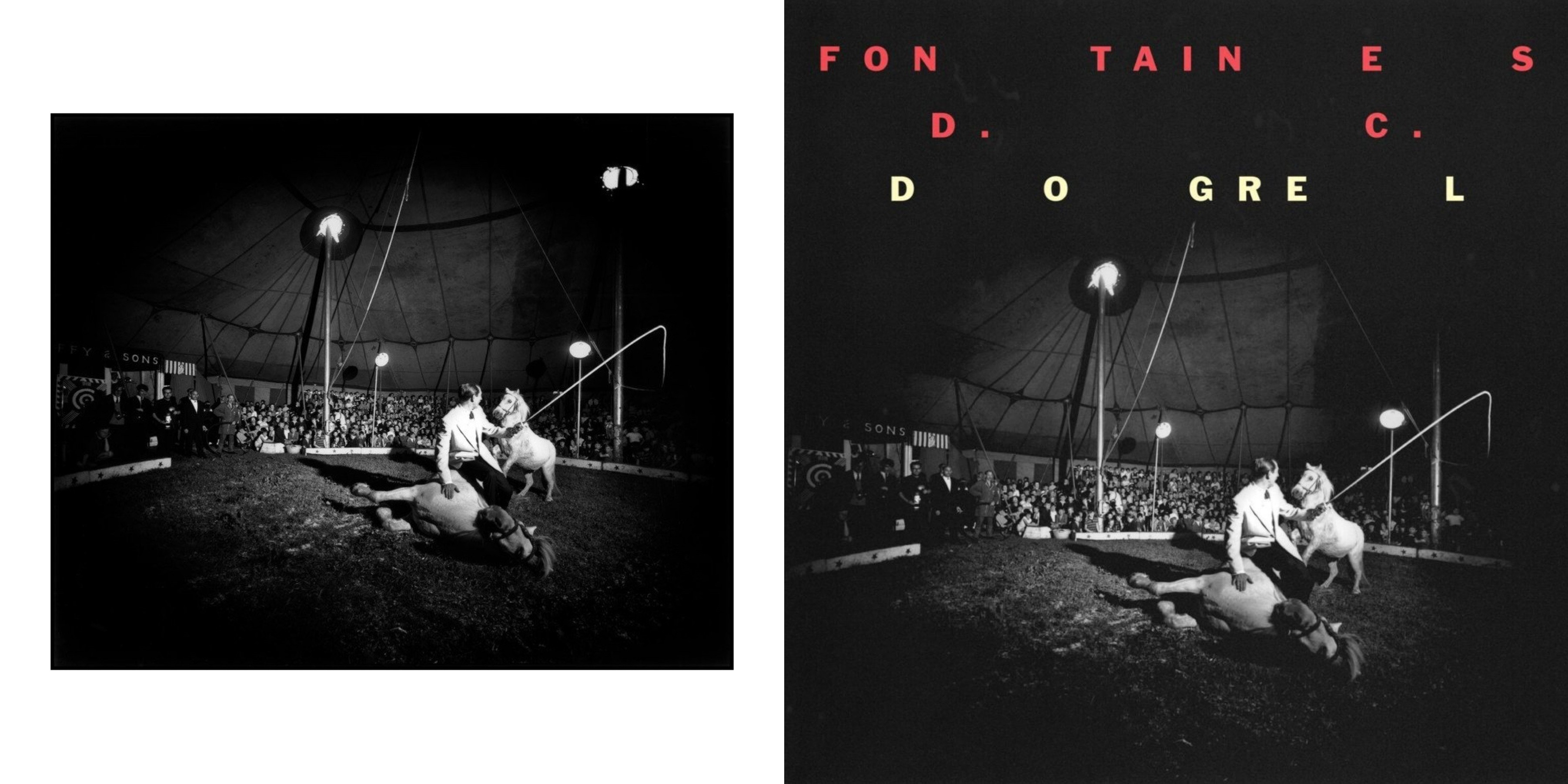
The Dublin band Fontaines D.C. used one of these photographs for the artwork of their debut album Dogrel (2019). The band chose this image because it represents performance, especially the vulnerability of performance.
Anders Petersen & Tom Waits
Café Lehmitz was a dive bar in Hamburg, Germany. A meeting point for prostitutes, pimps, and petty criminals. Anders Petersen chanced upon the café in 1962 as an 18-year-old and made friendships that would impact his life. In 1968, while attending a photography course in Stockholm, Anders returned and, over the next three years, made the photographs that became the book Café Lehmitz (1978). The image on the cover is Lily and Rose (1970), a couple of regulars. Lily’s charisma had men falling for her, and she knew it. Rose, a sentimental guy, who got his name because of a tattoo on his chest, was one of them.
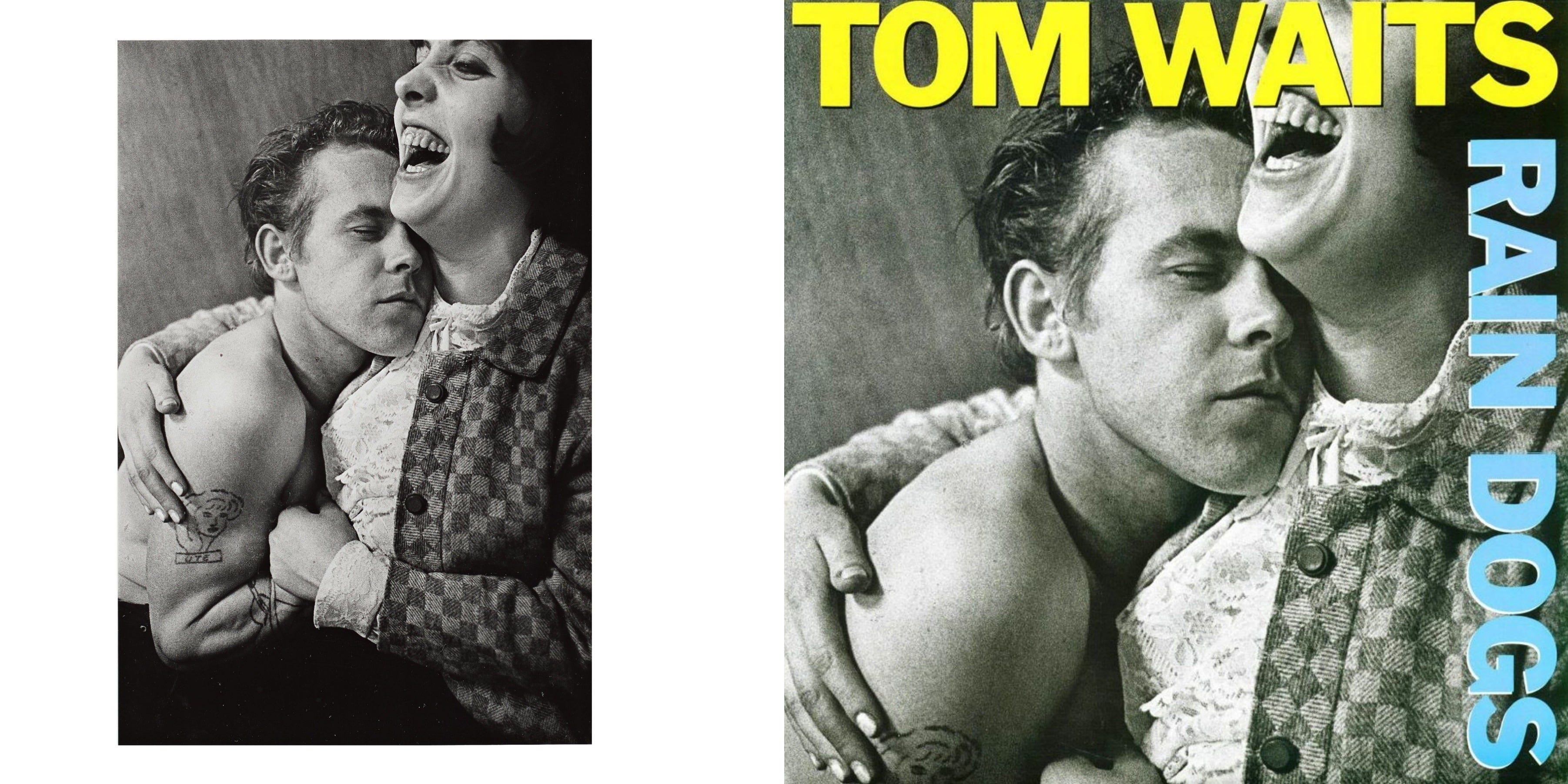
American troubadour Tom Waits chose the photograph for his album Rain Dogs (1985) because the songs are about human beings that are lost, in pain and with no sense of direction, people that sleep in doorways and do not have a social or physical place to belong.
Weegee & George Michael
When he wasn’t at a crime scene, the photojournalist Weegee spent a lot of time making images of New York for his photobook Naked City (1945). One of those pictures was Crowd at Coney Island (1940).
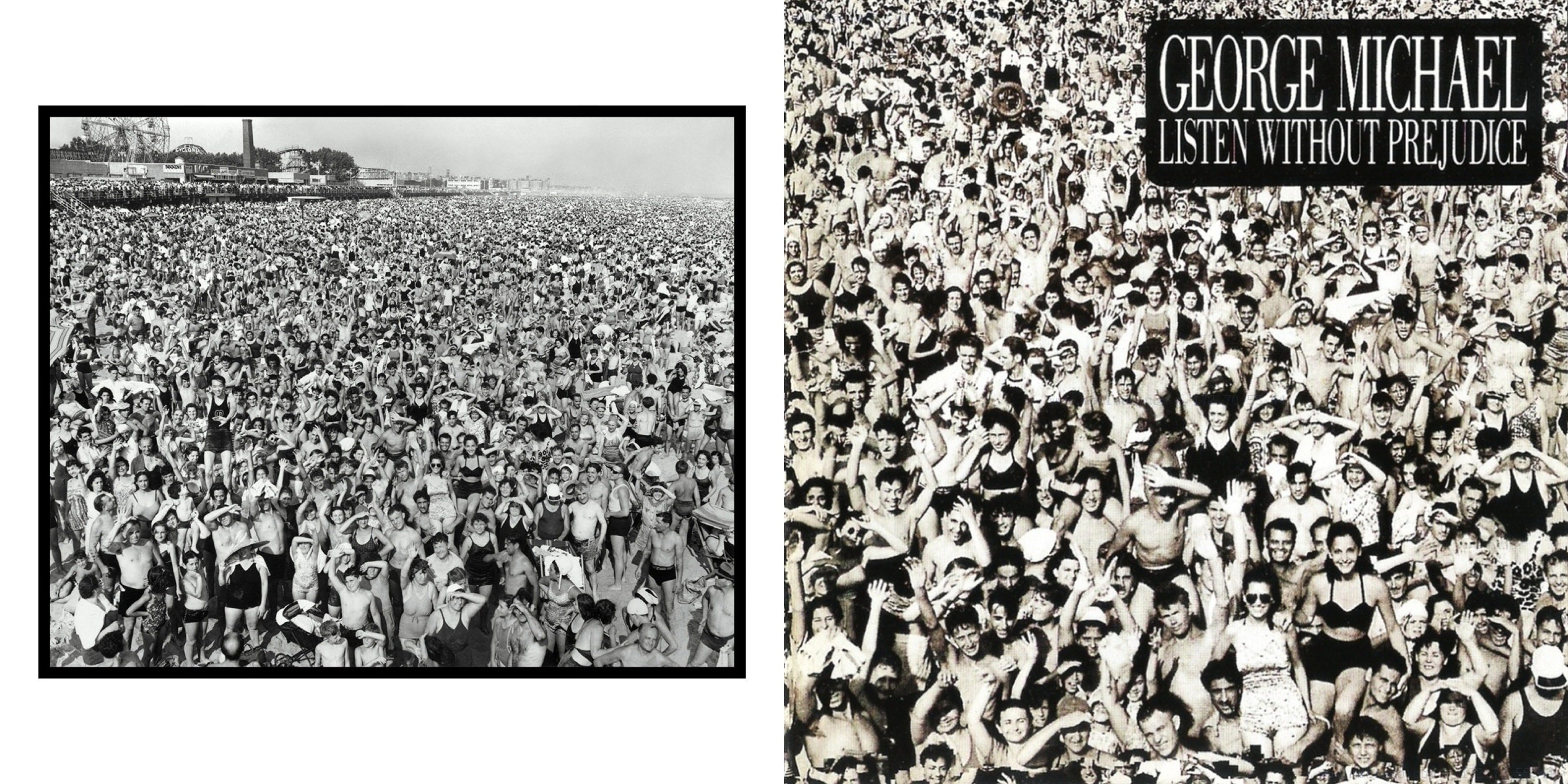
For his album Listen Without Prejudice (1990), George Michael’s initial idea was a plain sleeve with no reference to himself. He wanted to be judged solely on his music. But there were commercial concerns. So George and graphic designer Simon Halfon had to come up with another idea. As they flicked through an anthology of 20th Century photography for inspiration, the Weegee photograph of an estimated million sunbathers jumped off the page. They knew instantly. And to complete George’s vision, a heavily cropped version that removed all traces of the location became the cover.
William Klein & City Kids
When William Klein returned to his native New York after eight years in the army, Vogue commissioned him to create a photographic book about the city. Klein produced a gritty uncompromising portrait that the magazine rejected. So, he took his photographs to Paris, and they became one of the most influential photobooks ever made Life is Good & Good For You in New York (1956).
Perhaps his most well-known photograph was Gun 1 (1954). For years, I wondered about the story behind it. Then I saw this quote from Klein. “It’s fake violence, a parody. I asked the boy to point the gun at me and look tough. He did, and then we both laughed, which the next frame shows. Knowing this, I see it in another context. And even more, another: as a double self-portrait. I was both the street kid trying to look tough and the timid, good little boy on the right.”

In the early 80s, French rock band City Kids were getting started and looking for an image for their debut EP, The Name of the Game (1983). One of the band members had found a print and, without realising it was by William Klein, cropped and coloured it and used it for the record sleeve. Initially, Klein wasn’t happy. But when the band went round his Paris apartment, they sorted it all out over a cup of tea. After coughing up a few francs, they became friends, and Klein let them use other images for their next two albums.
Elliott Erwitt & Mark Knopfler
In Valencia, Spain, in 1952, Elliott Erwitt made an intimate portrait of a couple dancing cheek to cheek in their kitchen. The moment is unstaged, and the scene has a voyeuristic feel as we look at the romantic moment through a doorway. The dancing couple is Robert Frank and his wife, Mary. And the photograph is featured in Erwitt’s book Snaps (2001).

Fifty years later, Mark Knopfler used that image for his album The Ragpicker’s Dream (2002). The songs are about dignified working-class people and their determination to survive. And the scene with the natural mess of the kitchen and tilted camera angle captures the enigma of couples and everyday life – a topic that inspired Elliott throughout his career.
Robert Frank & The Rolling Stones
The Americans (1958) by Robert Frank was a book that disrupted notions in photography. It was bold, broke tradition and showed the America many did not want to see. There were 27,000 outtakes from the book. And one of them was a photograph of a collage of circus freaks on the wall of an 8th Avenue tattoo parlour in New York.
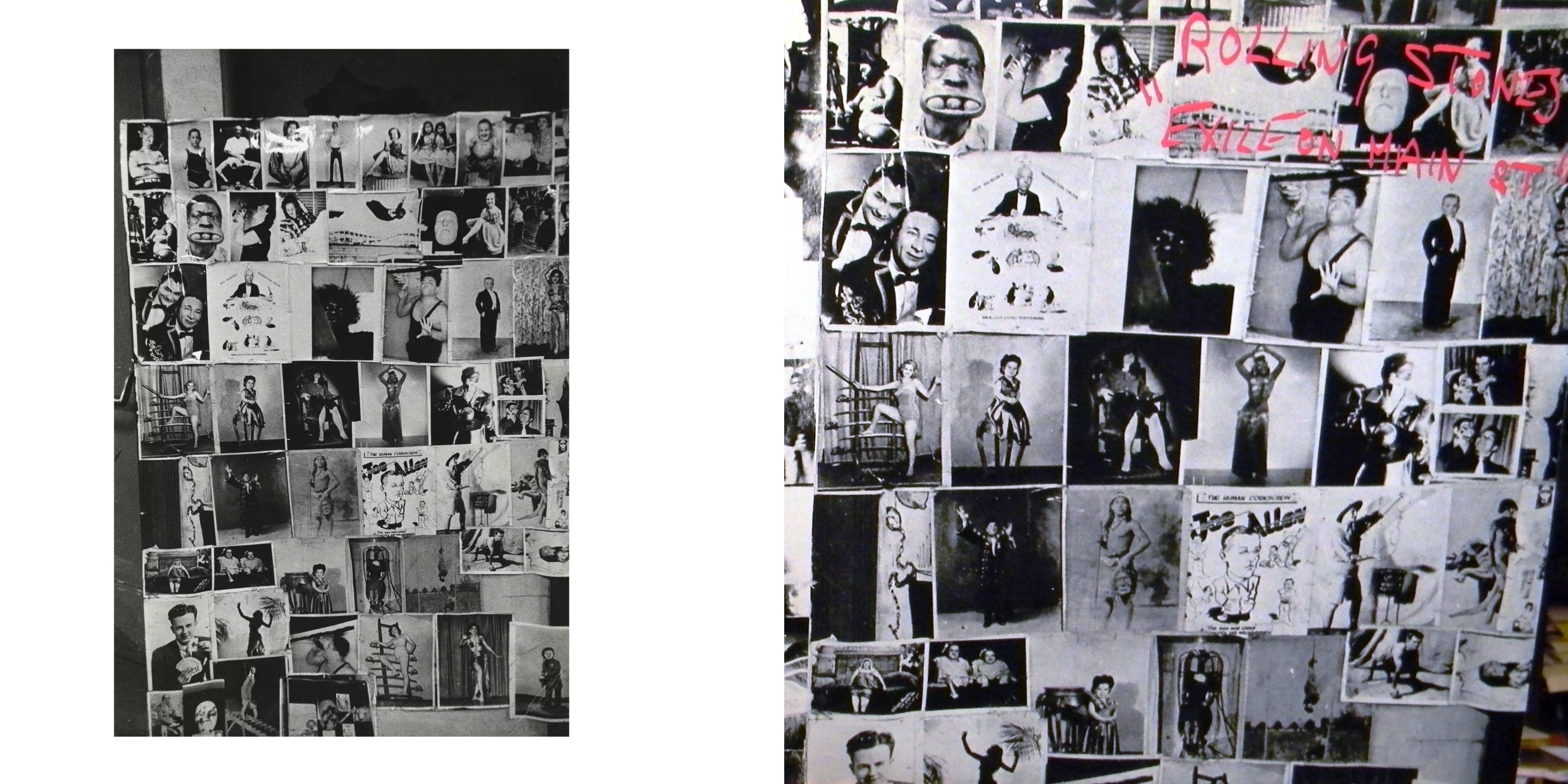
In 1972, the Rolling Stones made a raw and uniquely American album. For the artwork, Mick Jagger wanted to depict the band as “runaway outlaws using the blues as their weapon against the world.” And reflect a “feeling of joyful isolation, grinning in the face of a scary and unknown future.” He contacted Robert Frank with the idea to shoot the band walking along the seedy Main Street in LA.
Around the same time, the tattoo parlour photo caught the eye of John Van Hamersveld, the man responsible for the album package. And he wanted it for the front cover. The two ideas converged. To cast the Stones as drug-fuelled tax exiles and perpetual outsiders, they gave Frank’s Main Street photos an identical layout to the collage and used them for the back cover. Van Hamersveld said before those back cover photos, the album was simply Exile. After those photos, it became Exile on Main St. (1972).
Great photography has a timeless quality. It is not bound to the era, genre, culture or medium it was created. This freedom lets the emotions and experiences captured in the frame define music made decades later. And gives us viewers and listeners a thread to pull and new interpretations and connections to make.
This article was first published with the Raw Society in October 2022.
Big Star's Radio City has an Eggleston's Red Ceiling on its cover. And of course, Blur's latest has a Parr photo on the sleeve. I may have to do a blog on this topic sometime in the future, as I'm sure there are others. :)
https://en.wikipedia.org/wiki/Radio_City_(album)